Place Card Design Tips: Drawing Artistic Inspiration From Graffiti
An introspective journey into graffiti art and how to use its bold elements to enhance your design.
Key Takeaways:
- Artistic expression turns everything into a canvas
- Graffiti artists are masters of color combination, texture, and shadowing
- Creativity involves using influences in your environment while staying authentic
Graffiti as Inspiration
Artistic inspiration is required whether you’re creating a tiny place card or a massive portrait. Sure, you could put post-its on chairs and call it a day. But if you’re here then that’s not how you roll. You like things to be nice. You like creating an environment, a mood. And you throw an awesome event. Hopefully by now you see how all the small components of your event culminate in one beautiful theme. So let’s get more intune with our creative side and talk about how you can draw inspiration from graffiti for any artistic journey; place card or otherwise.
Graffiti Infamy
One of the most infamous acts of graffiti was “Kilroy Was Here”, sketched by many soldiers during World War II. It was a marker for those who would pass through behind them. The sketch, which included the figure of a bald man with a big nose and the words “Kilroy was here”, was more than a sketch. It was a form of communication. In other words, it was a way of saying, “we were here.” This is one of the earliest examples of someone using art as a way of marking one's existence (notwithstanding hieroglyphics). The more places you saw it, the more places your team had been. As you can see through its evolution, graffiti is a way of being seen.
Tagging Graffiti’s Meteoric Rise to Popularity
We’re not going to go all the way back to the first drawings we found appearing on cave walls, known today as hieroglyphics. We'll fast forward past the Ancient Romans and Greeks who wrote their names and protest poems on buildings. Let’s head to the beginning of Modern Graffiti which appeared in major metropolises like New York City and Philadelphia during the 1960s.
Tagging started as an individual looking for clout and evolved into crews claiming their territory. After initially being greeted with open arms, mayors and officials started cracking down on graffiti, upping the penalties for being caught. This ushered in a new age and element to graffiti: the act of bravery and a game of showmanship. If someone tagged a ten foot building, the next person would look for a twelve foot building. Taggers started tagging railroad tracks and skyscrapers. The danger and rarity of placement became of equal or higher value than the tag itself.
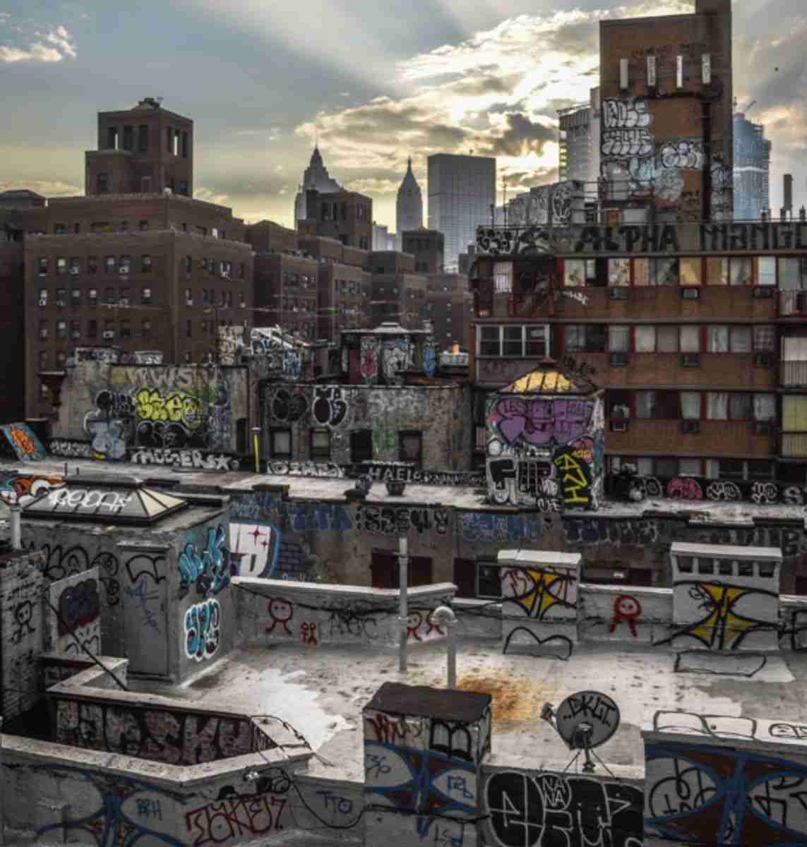
Unlike the days of the 70s where graffiti was an immersive experience, it was harder to come by in the following two decades thanks in part to Mayor Lindsay’s new policies. The heightened attention and punishment drove graffiti artists even further underground. This pushed artists and taggers to new heights, literally and figuratively. Below we see graffiti seemingly touching the sky. This is another example of tagging in difficult, dangerous locations with high visibility.
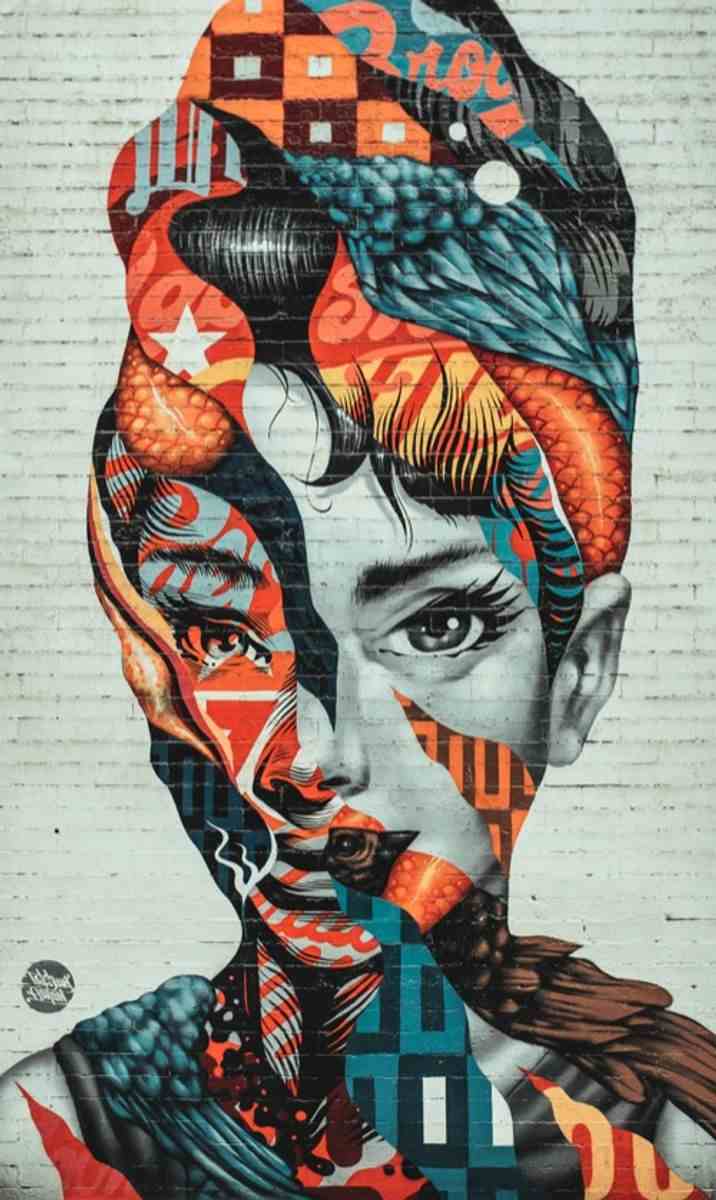
Graffiti & Pop Culture, Their Progression to Mainstream
Andy Warhol is widely credited as the leader of the visual art movement, which would become known as “Pop Art,” ushering in a new era of postmodernism. Many of Warhol’s contemporaries exploded onto the scene as well such as Keith Haring, Jean-Michel Basquiat, and Peter Max. Though Haring, Basquiat, and Max were more free form and not as based in preexisting pop culture in the same way, their art would capture the essence of this movement: rebellion. Their art would proliferate this new art form, composed with bold colors and sharp contrast.
This irked the elitist art enthusiasts of the era, especially pop art like Warhol's, which they felt was too elementary and non-substantive in subject matter. Unfortunately for them, the sense of rebellion, inclusiveness, and expression was too intoxicating. Soon new artists from diverse walks of life began pouring in. There are too many to name, but I’m personally a huge fan of Mr. Cartoon Machado, David Choe, and Banksy. These artists took graffiti from an accepted artform to the most influential art of its era (in my opinion).

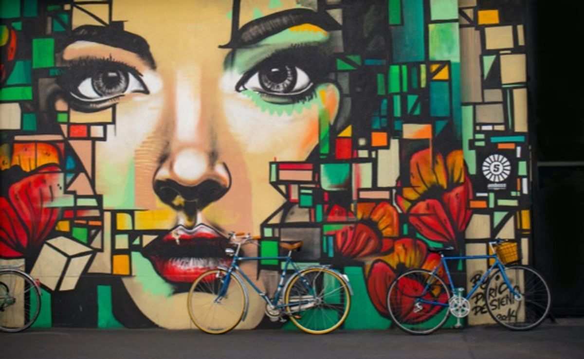
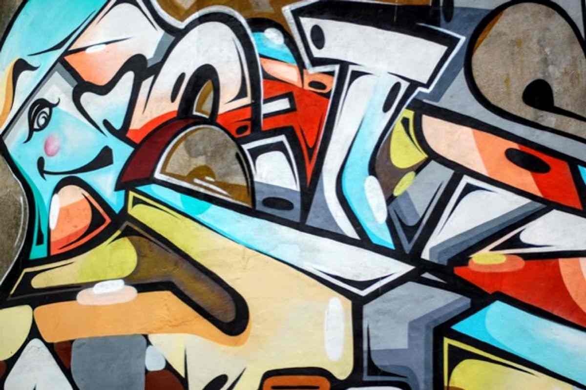
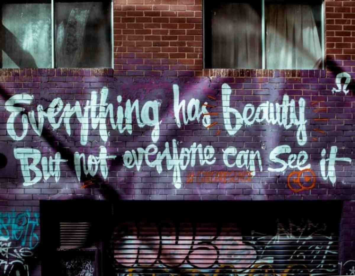
Applying Graffiti Aspects to Your Design with Bold Colors
A large part of graffiti culture is being seen. Bold colors that pop are used to draw the viewer’s attention, especially in areas that are already home to other graffiti. When you combine bold colors, shadowing for depth, and well designed contrast, you can make a piece that demands attention. Below we see a beautiful example of cool, bold colors.
When planning your design, think about the environment. What colors will stand out? Do you want your design to pop or do you prefer a more subtle touch? In our wonderful world of diy place cards there are infinite color combinations to truly personalize your printable place card design. Is your event outdoors or in low lighting? These are some of the questions that will help you decide how your place card design should look. There is no difference if you’re an artist. You have to think about where your design will be displayed. For more on color options in design check out our last design inspiration article
Applying Graffiti Aspects to Your Design with Pastel Colors
Pastel colors are pale in appearance, which is achieved by a combination of high luminance and low saturation. The luminance, or amount of visible light in coloration, is high. Inversely, the color saturation is very low. Color saturation can best be described as the potency of the color. A pastel color can be created by adding luminance to any pure color on the color wheel. Pastel colors add a playful, light, and whimsical tone to any design. Further, pastel colors create a soothing effect, especially for visitors. Pastel colors are also associated with femininity.
Derived from pure colors, pastels elicit strong emotions. They are associated with love, peace, and joy. This makes pastels an excellent choice for baby shower place cards, wedding place cards, and birthday place cards. Pastels are especially prominent in the Spring and Summer months, as they create an aura of freshness, cleanliness, and renewal. So if you want your place card design to comfort and ease your guests, this is the choice for you!
Shadowing for an Added Dimension
Shadowing adds an element to your design that color cannot. Think about it; we see everything in everyday life in 3D. Your place card can only provide you with 2D. This two dimension/three dimension conundrum creates a dissociation between the way we view the world on a day-by-day basis versus what paper and screen provide. Paying attention to the interplay of light and shadow in real life can give us some great inspiration for making our designs look more life-like. Adding elements of light and shadow into your designs can help bridge that gap, giving your 2D designs a more realistic, almost 3D appearance.
Shadow adds depth to your design, unlocking that 3rd dimension. The perspective of that depth pops off the page and grabs the attention of your audience. This can be especially useful for functional design, such as place cards. The place card can be beautiful, but it is also purposeful. In this case we want a design that compliments functionality. You may want your place cards to blend in with your place setting, or, you may be in a large room and want the names to truly stand out. If you’re looking for the latter, shadowing may be especially effective.
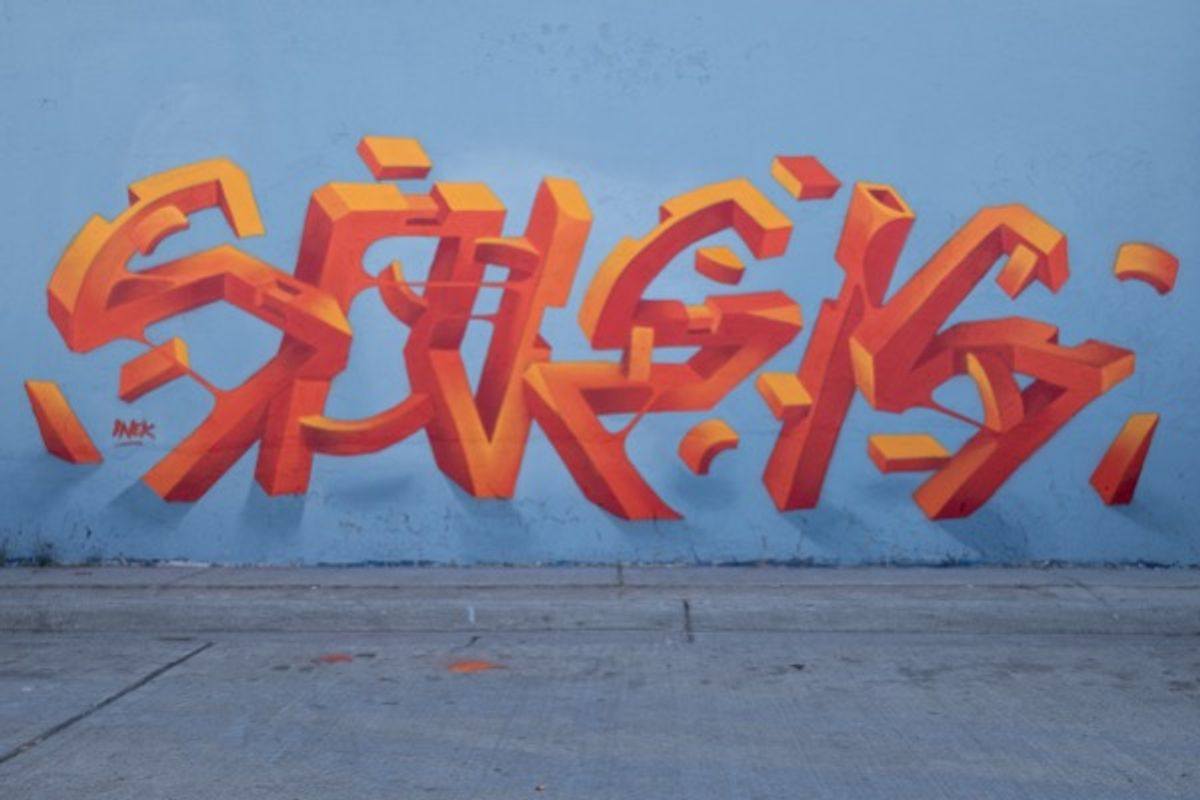
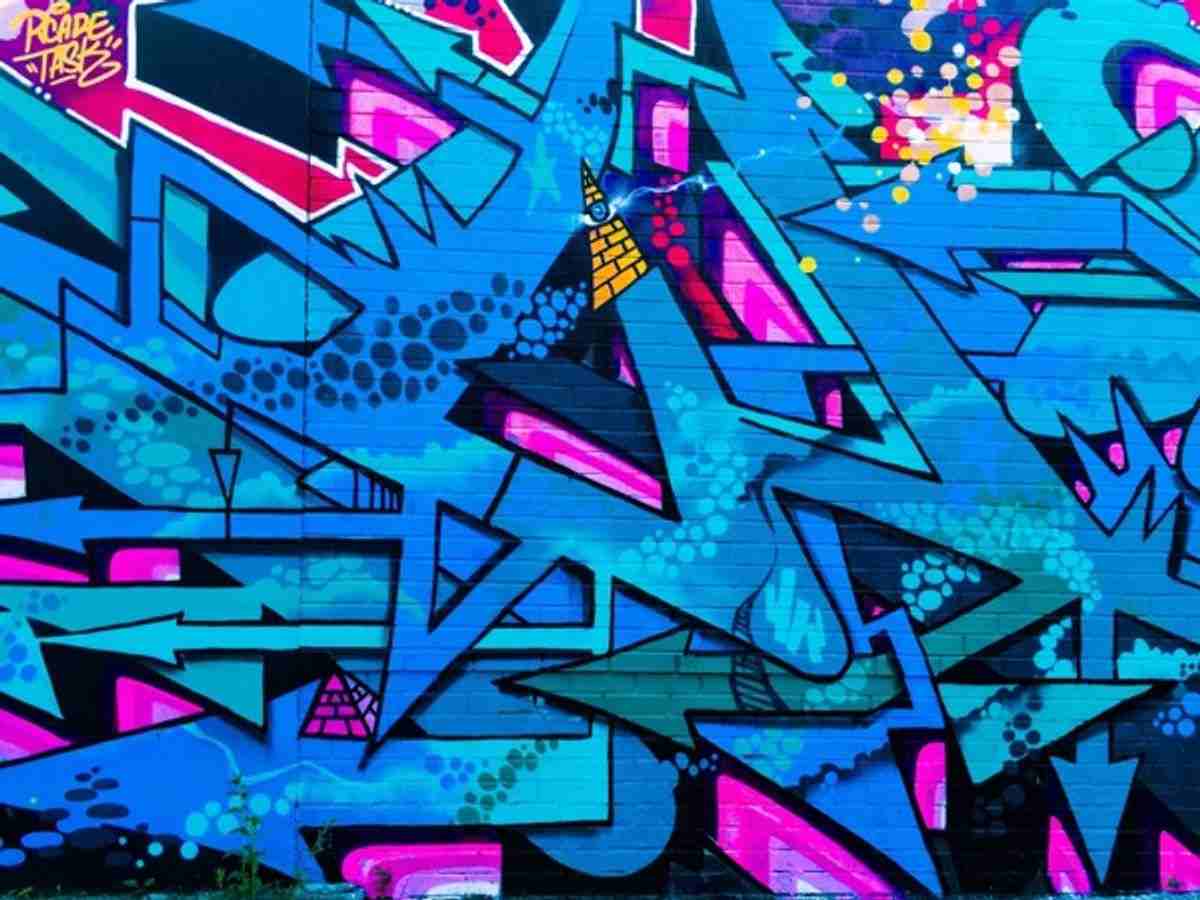
The problem with shadowing arises out of inexperience. It is easy to spot an amateur design, usually because of the flagrant overuse of shadowing. The key is to use shadowing sparingly and elegantly, like the image above. I mean look at that...it looks like the image is falling right off the wall and onto the floor! That’s truly special. It really is better to use just a little than way too much. In fact, the designer can create effective shadowing solely using variations of color. Consider moving up and down the color pallet for varying shades of the same hue. This trick captures and stimulates the eye because we perceive depth based on the relationship of light and dark.
Applying Shadowing to Typography
As promised, this article was partly written to follow up on our calligraphy post. So here we are; talking about graffiti, design, and how to craft the perfect diy place card. As we discussed last time, typography is a lot more than choosing a font. Its where we separate the artist from the amateur. So what better of an opportunity to take what we’ve learned and apply it. By changing the lighting and interplay of colors in our design, we can truly make something special. Remember you don’t have to apply your effects directly to the font, you can use secondary colors, or fonts with shadowing to help.
To make your text pop consider mimicking embossing with shadowing outside the letters and accentuating inside the lines. Alternatively, you can invert the shadow and highlighting to give a more recessed appearance. Despite its recessed nature, sunken font is a great way to capture your audience. You’ve already realized you want to create your own unique design. Our place card designs are here to help you craft the perfect custom place card. Make sure to keep some of these typography concepts in mind when choosing the best place card template. For more on typography and its roots in calligraphy check out our recent article on Calligraphy and Typography
Adding Texture to Your Design
We’re not talking about how the artwork feels to the touch. In this instance, we’re talking about how the surface is perceived to feel. Due to the limits of the average printer, texture in printed typography is more of a visual effect. Softer rounded corners, shallower lines, and less depth will generally give more of a soft and fluid appearance. For a bolder appearance go with sharp, deep lines. The appropriate use of these techniques will help set a mood and a tone for your piece. It is also used to attract or repel interest to an element depending on the pleasantness of the texture.
Texture rich fonts are another way for your place cards to come to life. The canvas varies for a graffiti artist. They could be painting on wood, steel, concrete, brick, etc. Brick adds a roughness, whereas metals create a flat and smooth appearance. Paper, in this case placecard paper, is your canvas. Smooth glossy paper will show ink and font differently than a flat or textured paper. Though we suggest avery paper for your place cards, the choice is yours.
Give it a Try
The most prominent characteristic, shared by every graffiti artist, is their boldness. Sure, scaling tall buildings in the darkness of night is daring. The true rebellion was in their artistic expression. People pushed boundaries, asked questions, and referenced other artistic stylings (like we just discussed) to influence their genius. It was their ability to create, iterate, and perfect an art style that made graffiti art what it is today.