Calligraphy, Typography, and Their Influence on Design
Pick the perfect font every time! We share an overview of calligraphy, typography, and how these art forms affect place cards, place card design, and other DIY projects.
Key Takeaways:
- There is subtle elegance to font and typography
- Use font style to personalize your place cards, invitations, and thank yous
- Calligraphy was practiced by some of the most prevalent cultures around the world
A Brief Overview of Calligraphy
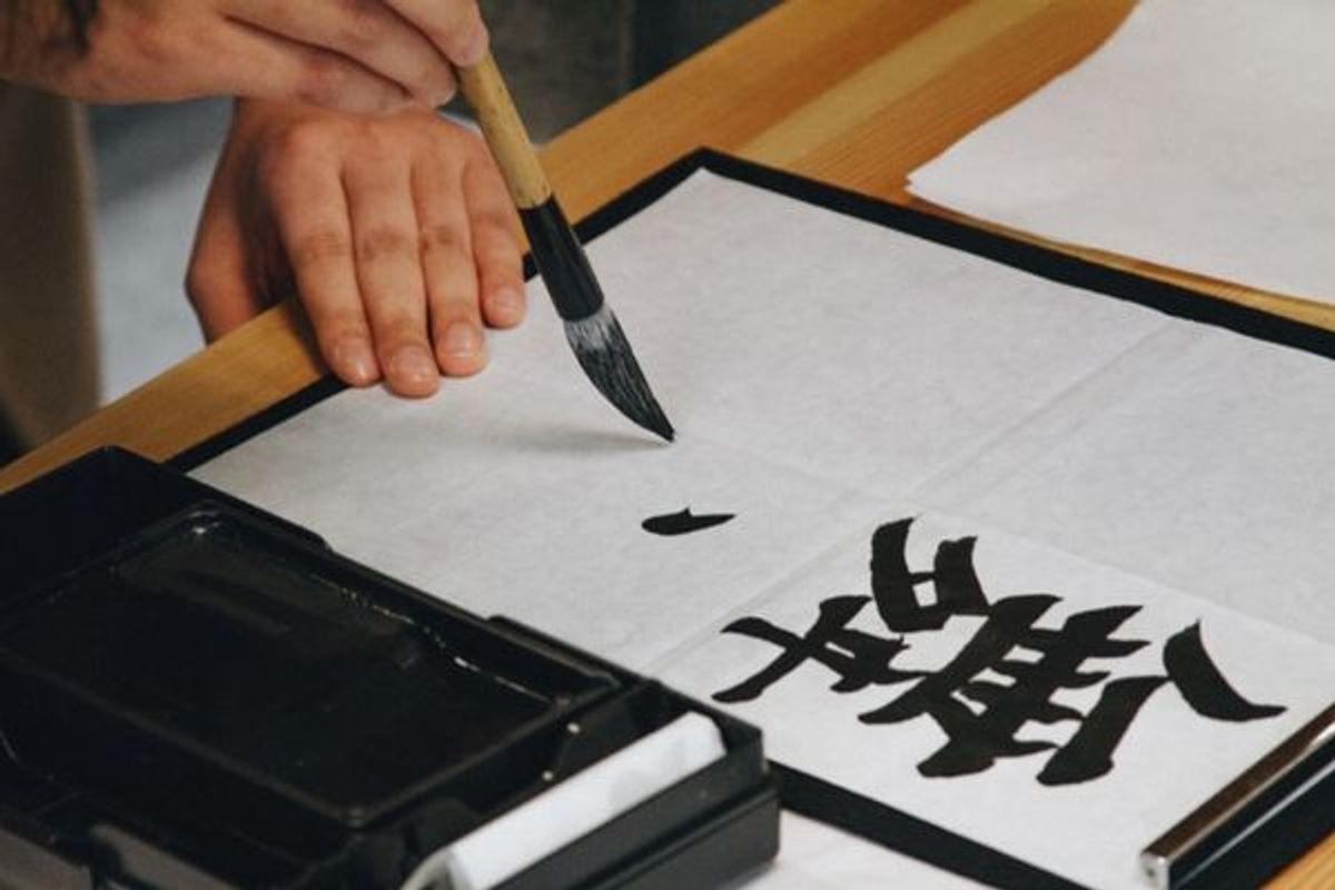
Calligraphy is so old that it's arguably one of mankind's earliest art forms. Calligraphy is the visual art practice of writing in which an instrument is used to manifest the artist's motif with beautiful symbols. These symbols not only convey a message..they are a message. In Chinese calligraphy, the symbols express emotions, and elements that occur around us. The disputed origins of Calligraphy only further its allure.
Calligraphy is an ancient practice that requires years of training, so be thankful for typography (your computer) and use it wisely! Today we’re going to pay homage to an art that is practiced in many areas around the world. We’ll glance over why it is important, how it ended up influencing fonts on your computer, and how to tie this into any design. We hope this helps with your place card design.
Paying Homage to Chinese Calligraphy During Asian-American Heritage Month
The universal element of all Chinese art forms is nature. Cangjie, inventor of Chinese writing, drew inspiration from the natural occurrences in life around him. In regular script each stroke, even each dot, suggests the form of a natural object. As every twig of a living tree is alive, so every tiny stroke of a piece of fine calligraphy has the energy of a living thing. He observed the impressions of animal trails, such as claw, tail, and paw prints. Using the simple tools around him, Cangjie began replicating and enhancing these images in the form of lines, dots, and dashes.
The artisanal writer has a name too. They’re called calligraphers. Each calligrapher has their own combination of art and tradition. It is at this crossroads of imagination and science that the calligrapher finds their own style. The style is evident in the strokes of the quill, which imitate the strokes of a paint brush.
Firm and light pressure can be sensed as well as patience or haste. They should not be edited in any way once the stroke is finished. The ink setting into the paper is the final destination of each stroke. The quill strokes may be what you read, but it is what you do not see that is equally important. The space between each character must be balanced.
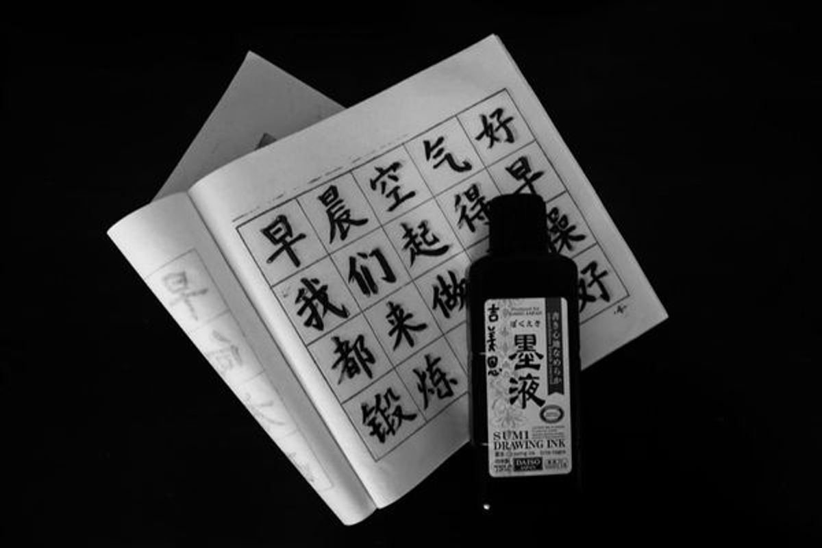
Calligraphy’s Journey to your Computer
During a commencement speech at Stanford University famous inventor and genius Steve Jobs explained the power calligraphy had on him as a young (and lost) student. Jobs immediately recognized the beauty of excellent calligraphy that was achieved when each character was made with wisdom and grace. The emphasis in things seen and unseen, such as the varying amount of space between different letter combinations or the size and scale of characters in relation to each other, was not lost on Jobs' keen eyes. The combination of curiosity and admiration led Jobs on a journey as he sought to understand what makes typography great.

Jobs remembers, “It was beautiful, historical, artistically subtle in a way that science can’t capture, and I found it fascinating.” 10 years later, while creating the first Mac, Jobs recalled this information and made his first Macintosh computer with beautiful typography. Jobs' love for serif and san serif fonts were especiallly on display. Jobs credits the multiple typefaces and proportionally spaced fonts that are now standard on all computers to his studies of calligraphy.
Calligraphy in Graffiti Art
Do you remember the first time you saw graffiti? Maybe it was right in front of you sprawling across the brick facade of a corner store. Graffiti, specifically tagging, can be anywhere; along a wall under a bridge, alongside an overpass, on top of a building, etc. Just as calligraphy seeped into typography, it is also ever present in graffiti culture.
We owe the term ‘graffiti’ to Norman Mailer, when he popularized it in an edition of The New York Times. Around this time (the 1970s) graffiti was adopted by pop culture. Once seen as a rebellious form of defacing property was now an artistic expression. As graffiti art reached peak popularity in cities around the United States, opposition grew. Mayor John Lindsay publicly denounced graffiti in New York City. Naturally the allure grew to a fever pitch.

How does this relate to calligraphy or graphic design? Next time you pass a well done piece of tagging or graffiti take the time to study it. Notice the even font height. Notice how the artist accentuates letters of importance. Look at the curvature or rigidity of the font, the shadowing, and its spacing. Sometimes its spontaneous and other times disciplined. Graffiti is art, no doubt, and it can subtly teach us many of the same principles seen in calligraphy.
Want to learn more about graffiti art? Look for our upcoming article dedicated to graffiti!
Calligraphy’s Transformation to Typography & Graphic Design
Typography draws from the calligraphy art form. In a sense, it can be seen as a modern evolution. Typography is the arrangement of letters and spaces that make words legible. Like calligraphy, typography involves taking pride in the appearance and beauty of the type. Also like calligraphy, there is conscious effort put into font shapes, lengths, sizes, and spacing. Typography is, in a sense, a marriage of all of these aspects.
The typography process begins by deciding which emotion the writer seeks. From there, they must choose a font that matches the stylings and sentiment you hope to bring forth. Think of it like this; the composer thinks of the response they hope to elicit from their target audience. All the actions they take from that point forth, all of the decisions they make in regards to stylings, will hold that goal of communicating a proposition and garnering a response from the audience.
Applying This Knowledge to your Place Cards
Oftentimes in artistic creation there are many small components that culminate in one awesome work of art. In other words, the final piece is a sum of all the smaller details. Your reception setting will transform into an amazing atmosphere. Your place cards are part of this atmosphere, but like other little details, can often be overlooked and then hastily rushed. You wouldn’t just stick a bunch of post-it notes to your chairs so why would you waste your time making bland place cards.
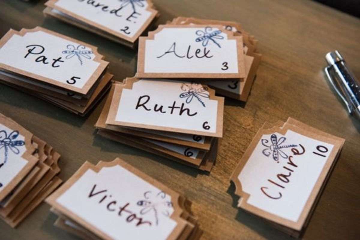
So when thinking about place cards it’s important to consider that the text is arguably more artistic than the card. Similarly, the tiny place card itself is more critical to your overall ensemble than you realize. Go with professionally designed and do it under budget. Be sure to use careful consideration when choosing the font. Pay attention to the character spacing and font height. Don't worry though, we’ll make sure each card is perfectly centered. Steve Jobs went out of his way to bring calligraphy right to your untrained finger tips. Utilize this ability.
Parting Words
Artfully inspired typefaces will complete any place card design. It also applies to DIY menus, DIY invitations, and DIY thank yous. When you choose a font, try to capture your mood, environment, cadence, vision, and the little variance in each stroke. Make your creation truly unique.