Creative Inspiration for DIY Place Cards
Creative ideas for DIY Place Cards that save time and money. Take the stress out of your place card design with our guide and go from stuck to finished without the headache.
Key Takeaways:
- Working with customizable designer templates allows you to get creative without being overwhelmed
- Pull colors from your venue when designing your place cards for a uniform theme or intentionally clash with your theme for a bolder look
- Fight creative fatigue by forming a game plan, starting with the easiest small tasks, then gain momentum from there
Design is difficult. Burnout is real. Deadlines exist. This is why we outline how to identify creative fatigue (burnout) and how to beat it. Once you get over the hump quickly and comfortably we’ll cover how to unleash the artist inside all of us. Then, we’ll take a deep dive into the color wheel, color theory, font selection, and thematic design. If you’re ready to design, just CLICK HERE to jump straight into color theory. We’re here to guide you through your creative journey with helpful insights.
Fighting creative fatigue
Creative fatigue is commonly known in the writing community as “writer's block.” We call writer’s block for artists, musicians, and event planners creative fatigue. Creative fatigue happens when you get overwhelmed or exhausted by the stress of creating something. This produces the feeling of burnout. Regardless of what it is, you’re stuck. This is usually the point where the hair pulling begins and productivity ends. But fear not! You already took the right first step. You searched around for experts that truly get event planning and you found us.

The best way to beat creative fatigue is to begin planning. Even if you’ve already started. Take a step back. Elon Musk is a master engineer, among other things. He creates things others can’t fathom under extraordinary time constraints and pressure. He does this by “reductionism” or taking everything down to ‘first principles.’ In other words, get to the core of what you’re doing. Then implement a plan. Elon’s task management is unbeatable, but you can still lighten your load by copying a living legend. Create a list of steps you need to accomplish your first small task. Then execute and repeat.
Every event has a different timeline and set of circumstances; there is no “all-in-one guide.” Because it’s in our nature, we’re going to focus on event planning. Despite what you’re struggling with, know that your creative beauty and instincts are still inside you. We just need to wake them up. Remember to fight the sense of being overwhelmed. Instead of snowballing our stress, let’s snowball our success. This means starting with the tasks that are well defined and simple. We know we’re going to need a date, which means invitations. Once we have a headcount it's on to the place cards!
Finding a template
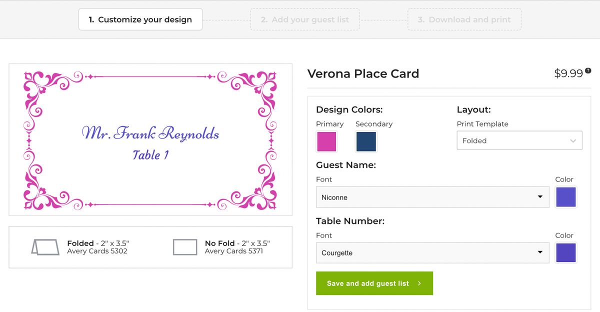
So let’s start by choosing a template. We make that incredibly simple. We continually edit, add, and remove place card templates based on current trends and popularity. In doing that we can deliver the perfect amount of elegant choices. Like we spoke about earlier, the goal is to fight making things overly complicated or overwhelming. Our view is that too many place card templates means too much time spent on menial tasks. If you like more than one, sleep on it, but give yourself a deadline. Remember it's all about simplifying.
For business events consider one of our most popular place cards “The Madison,” which has sharp thin lines and a clean appearance. For more casual events look for templates that are bold like the Lombardy . Place cards that allow for two different colors are great for coordinated themes like sweet 16s, bridal showers, baby showers, weddings, and team events. Our Kensington is one of our several offerings which have more than one customizable color trim. But how do you pick your colors?
Picking Colors
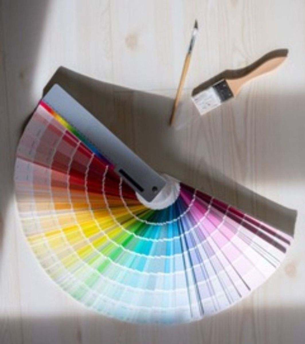
The color wheel is the basis for color theory. The color wheel is a way to interpret the relationship colors have to each other. In other words, the color wheel is orchestrated in a way so that colors which compliment each other are easily identified. Color combinations that clash are also identified. The color wheel has been used by legendary artists and designers and now it’s time for you to utilize it too.
Truth is, there’s a whole bunch of information available about the Color Wheel and Color Theory. We want to simplify our design process and avoid mastering art theory. Use these extra tips below regarding color theory if you feel that you ‘don’t have the eye for it.’ (Also, check back in the future for a deep dive into color theory, design, and how to DIY like Da Vinci in our upcoming blogs!)
Warm Colors
Understand the difference between warm colors and cool colors. Warm colors are usually associated with reds, pinks, oranges, yellows, and beige. Warm colors will soften the room and do well with softer, dimmer, and more yellow light. Warm colors do well with certain aspects of nature such as sunrise and sunset. This is great for outside events or big bay windows with the scenic sun in the backdrop. Warm colors are also associated with Spring and Summer.
So, let’s suppose we are having a spring or summer engagement party. Spring signals a time of rebirth and renewal and summer signals life flourishing, in full blossom. What colors should you use on place cards and decor in these months? We suggest the use of pastels (more on pastels here) in hues of yellow, peach, green, lavender, or pink. It is important to note that warm colors will “pop” more than cool colors in a neutral setting.
Cool Colors
As you can imagine, a lot of opposites to the warm color realm. Cool colors are usually associated with blues, greens, purples, and gray tones. Cool colors can offer a very calming effect. Cool colors do well with seasonality just like their counterpart. Blues and purples look especially nice during the winter months. When two cool colors are backed up to each other they can make a very defined border. Cool colors look best with brighter, whiter lighting.
Tints, Shades, Black & White
Black and white are achromatic, meaning they lack much of any color. They are essentially neutral. There are real-life benefits to understanding black and white. You may have heard that black clothes can endow the wearer with a thinner appearance. A more common known fact: black attracts solar energy and gets hotter than white, which do not have the same attraction to ultraviolet rays. What’s that mean for you? Not much, except understand that black will be less desirable during outdoor events in the sun. White, though better in the sun, will not do well with children, wine, tomato sauce, and the other billion variables that will be at your event. In this instance, black’s ability to hide stains and other blemishes is a huge advantage.
Black and white also act differently on the optic nerve. White will adopt surrounding hues. In layman terms, other colors will affect the appearance of white. Stark whites in soft light will appear slightly yellow, while high color temperatures will make white appear brighter and more sheen. The intentional contrast of white and black can add depth to two dimensional services. This method is often used in painting, especially in the depiction of shadows. White and black are optically pleasing when reading because they are so easily distinguishable. This is why your emails are white background with black font. Black and white are perfect for business meetings and events where functionality is critical. (Pro tip: for a hint of color, try navy blue).
Monochromatic
Monochromatic themes are beautiful and fail-proof. When black and white are used to act upon an existing color they are considered tints and shades. Mixing colors, tinting, and shading can add lots of variation to a single color. For a monochromatic masterpiece simply take one color and then surround it by variations of that color. By doing this there is no possible way your design will clash. If you’re the “doer” type, then walk down to your nearest hardware store. In their paint aisle there are tons of color swatches, which can act as monochromatic templates for you. Staying in the same color family is an option when choosing flowers, centerpieces, and other venue decor. When making place cards with us, you have access to custom colors which will tint and shade for you.
Color Value & Saturation
Without going too deep into the weeds, color value and saturation are properties of colors. A color’s ratio of value and saturation dramatically affect its hue. This is how we come across pastels. Pastel’s have high color value and low saturation, which is a fancy way of saying they’re a pale version of the main color. This is accomplished by tinting. Pastels are known to have a soothing, light, and welcoming effect on those who see it and are a great choice for baby showers. Opaque colors are quite the opposite. They are more bold, vivid, and grabbing. When paired together, pastels and opaques can work wonderfully.
Font Selection for Your Place Cards
Calligraphy is one of humanity’s oldest art forms. Fortunately technology has made the process of elegant writing and expression much easier, albeit generic. Our computers have tons of font options that allow for customization. The problem is: many of them are ridiculous. We’ve narrowed down the selection to only the top rated options. 25 fonts to be exact. Place cards, menus, invitations, signage, and thank-you’s will all require font selection. We encourage you to let your place cards and other written items reflect your personality. How can something so simple as font selection impact your design? Let’s take a look at how font style is an overlooked accent.

How to Marry Color, Font, and Theme
So lets tie all this information together. Methodically going through every step in the creative process can help you beat the burnout and make place cards that are stunning and unique. Don’t forget that the place card is one of the first impressions your guest will form upon arrival at your special event. Perfect design is achieved by having an underlying theme while marrying color and texture throughout.